
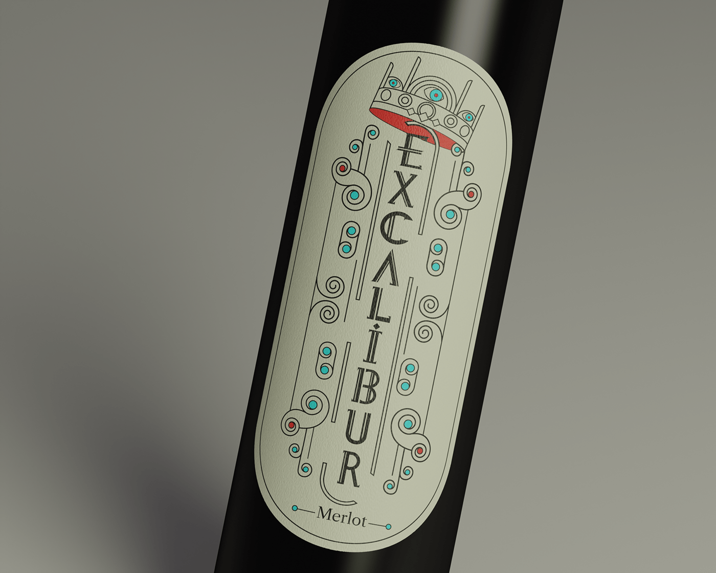
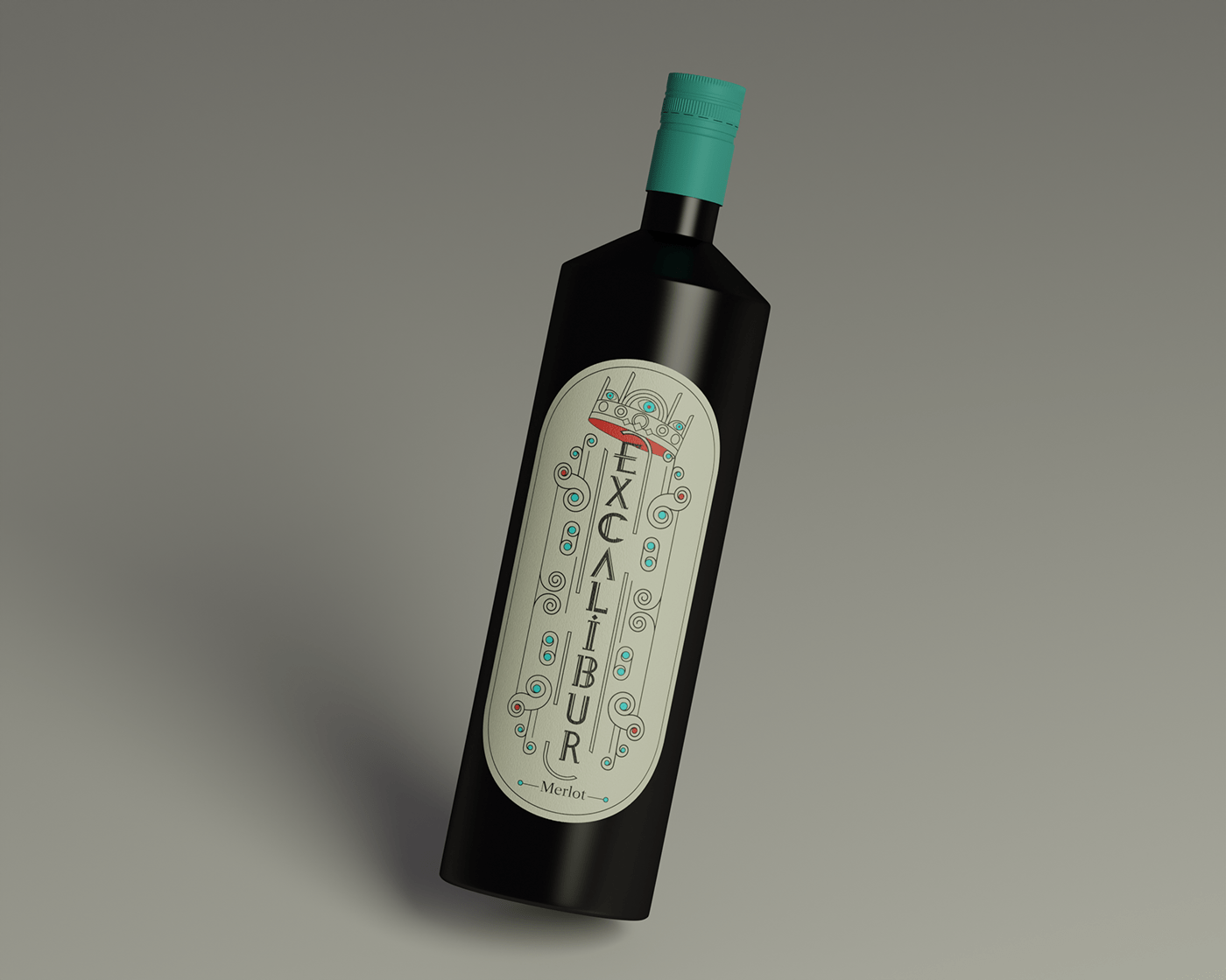
EXCALIBUR
Brand and packaging design of English wine. For the label design, turquoise and red colors were chosen. Red color symbolizes blood, turquoise color nobility and soul. At the heart of the composition of the label is a sword held by a hand that appears from the pupil of the eye, i.e. from the soul. The choice of the composition is determined by the legend according to which only the pure in thoughts can extract the sword Excalibur from the stone. To add to the authenticity of the design, a medieval font style was developed for the brand name. A separate task was the development of the wine bottle shape, which emphasizes the strictness and brevity of the brand.
ROLES:
Branding/ Package design/ Lettering/ Illustration/ Rendering


Thank you for watching!
Feel free to text me DM or email: taras5lech@gmail.com


